Branded QR codes carry your logo, brand color, and sometimes a frame, while still scanning on the first try. That last clause is the whole challenge. A QR code is a machine-readable grid with strict rules, and design pressure pushes against those rules. Add too much logo, pick the wrong colors, or crop the margin, and you get a code that looks polished on screen and fails on a phone in a shop. This guide is about staying on the right side of that line.
Design matters here because a QR code sits at the exact moment a person decides to trust you. They point a camera at a printed surface and wait. A raw black-and-white grid with no context reads as generic, occasionally as suspicious. A code that wears your logo and colors signals that the destination is yours and intentional, which lifts scan rates. The catch is that every branding choice spends part of a fixed reliability budget, so good custom QR code design is really budget management. Let's walk through what that budget is made of, then how to spend it.
What a QR Code Is Actually Made Of
Before you decorate a QR code, it helps to know which parts you can touch and which you cannot. A QR code is a matrix of dark and light squares called modules, and several regions of that matrix do specific jobs.
The three big nested squares in the corners are the finder patterns. They tell a scanner where the code is and how it's rotated. A fourth, smaller alignment pattern shows up on larger codes. Running between two of the finders are the timing patterns, alternating modules that let the scanner measure the grid. The rest of the area holds your encoded data plus the error correction that protects it. Around the entire code is the quiet zone, a blank margin that isolates the code from whatever surrounds it.
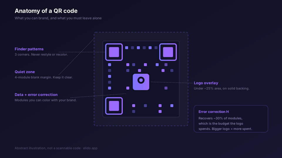
The practical takeaway: the finder patterns and the quiet zone are off-limits for branding. Cover or crop either one and the code stops working, full stop. The data region is where you have room to maneuver, and only because of error correction. The structure of all of this is defined by ISO/IEC 18004, the international standard for QR codes, which is worth knowing exists even if you never read it.
Error Correction Is the Budget You Spend on Branding
Every QR code includes redundant data so it can still be read when part of it is damaged or covered. This is Reed-Solomon error correction, and it comes in four levels: L, M, Q, and H. The Wikipedia entry on QR error correction lays out the recovery capacity for each, and the numbers are the ones that govern logo design.
| Level | Recovery | Where it fits |
|---|---|---|
| L | ~7% | Clean digital display, no overlay |
| M | ~15% | Plain print, no logo, light wear |
| Q | ~25% | Logo overlay, packaging, moderate handling |
| H | ~30% | Logo overlay plus outdoor or rough conditions |
That recovery percentage is your branding allowance. When you stamp a logo over the center of a QR code, the logo occludes modules. The scanner treats those covered modules as damage and reconstructs them from the parity data. At level H, roughly 30% of the modules can be missing and the code still resolves. So a logo "eats" into the H budget, and the bigger the logo, the more of that 30% it consumes.
Here is the part that trips people up: error correction is not free. Buying more recovery headroom means adding more modules to encode the same data. The same payload at H needs a noticeably denser grid than at M. That density is fine if the payload is small, and it becomes a problem if the payload is large, which is exactly why the static-versus-dynamic decision below is a design decision and not just an operational one. We unpack the version-and-capacity mechanics further in dynamic vs static QR codes, and QR code error correction levels shows the module counts for one URL at L, M, Q, and H.
Color, Contrast, and the Inversion Rule
The single most common way a branded QR code fails is contrast. A scanner distinguishes dark modules from light ones. If the two are too close in luminance, it cannot.
Brand color is welcome, with one constraint: keep the dark-light relationship strong. Deep brand-purple modules on a white background work. Mid-gray modules on a light beige background do not, even when they look readable to your eye, because a phone camera under poor light has far less dynamic range than you do. The safe test is luminance, not hue. Two colors can be visually distinct and still fail if they sit at similar brightness, like a dark blue on a dark green.
Standard orientation is dark modules on a light background. You can invert it, light modules on a dark background, and most modern phone cameras handle it, but older or cheaper cameras are less reliable with inverted codes. If your audience skews toward older devices or the lighting will be bad, keep it dark-on-light. Gradients are tolerable across the data area as long as every module stays clearly darker than the background it sits on. Never let a gradient wash a finder pattern out toward the background color.
The Quiet Zone and Minimum Print Size
The quiet zone is the empty margin around the code, and it is part of the spec, not a stylistic suggestion. The QR standard calls for a quiet zone of at least four modules on every side. Designers strip it constantly, because a blank border looks like wasted space in a tight layout, and a code dropped onto a busy background photo without that margin will fail to scan even though every module inside it is correct.
Print size is the other field-reliability factor. For a short-link code scanned at arm's length, roughly 2 cm by 2 cm is a sane floor. Scale up with distance. A widely used heuristic holds that the printed code should be at least one-tenth of the scanning distance, so a poster meant to be scanned from a meter away wants a code of 10 cm or more. Branding makes this stricter, because a logo and higher error correction both add density, and denser grids need bigger modules to stay readable. When in doubt, print it larger than you think you need and test it with an actual phone, not a preview on your monitor. An outdoor sign read from the street, like a real estate yard sign, pushes both the size and the error correction higher still.
These size and quiet-zone rules apply whether or not the code is branded, but branding shrinks your margin for error, so they matter more. The full print-distance walkthrough lives in our QR code campaign from scratch guide.
Why Branded Campaigns Want Dynamic Codes
There are two kinds of QR code, and the difference is what gets encoded. A static QR code bakes the full destination URL into the modules. A dynamic QR code encodes a short link, and the real destination lives at the shortener, resolved when someone scans.
For a branded campaign, dynamic wins on three counts that all matter to design and to results.
First, the payload is shorter. A short link like b.elido.me/spring26 is a fraction of the length of a UTM-tagged campaign URL. Shorter payload means a smaller version, which means fewer, larger modules at a given print size, which means more room to absorb a logo and better scannability on small surfaces. Branding and dynamic links pull in the same direction.
Second, you can edit the destination after the code is printed. A branded QR code is an investment in print and design, and freezing it to one URL is a liability. With a dynamic code, the landing page can change, the campaign can be extended, a broken link can be fixed, and not one printed asset has to be reprinted.
Third, every scan is a tracked redirect. Elido logs each one to our analytics store with timestamp, country, and device type, no sampling, so a branded code becomes a measurable channel rather than a hopeful gesture. You can also route at the redirect layer, sending iOS and Android scanners to different stores from a single printed code. None of that is possible with a static code, where the URL is frozen in the grid.
A branded short link and a branded QR code are two halves of the same idea. Put your domain on the short URL and your logo on the code, and the whole path looks like you. The mechanics of the domain side are in how to set up branded short links.
Static still has narrow, legitimate uses, a permanent statutory link or an offline-generated code with no server on the scan path, and we cover those honestly in the dynamic vs static breakdown. For branded marketing, though, dynamic is the default.
Design Do's and Don'ts That Keep a Code Scannable
Most of branded QR design comes down to a handful of habits. Here is the short version, paired with the failure each one prevents.
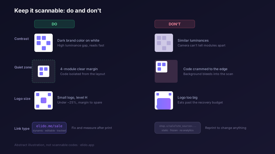
Do keep strong dark-on-light contrast. Don't pick brand colors that sit at similar luminance, and don't invert the code unless you have tested it on the worst camera your audience uses.
Do preserve the four-module quiet zone. Don't let a background image, a border graphic, or a tight layout crowd the code's margin.
Do size the logo modestly and use level H. Keep the logo under roughly 20 to 25% of the module area, sitting on a solid backing color so modules don't show through. Don't push the logo to the limit of the H budget, because real-world wear consumes the rest of it.
Do leave the finder patterns and timing patterns alone. Don't restyle the corner squares into rounded blobs or recolor them toward the background, and don't run a logo or graphic across them.
Do choose dynamic so the code is editable and trackable. Don't freeze a long UTM URL into a static code that you cannot fix and cannot measure.
A useful instinct: when a design choice and scannability conflict, scannability wins, because a beautiful code that doesn't scan has a conversion rate of zero. Every rule above is really that one rule applied to a specific temptation.
A Practical Workflow
Putting it together, here is the order that keeps the design and the engineering from fighting each other.
Start with the destination and wrap it in a dynamic short link, ideally on your own domain so the whole path is branded. Set error correction to H at creation time, because you intend to add a logo and the code will be printed. Generate the code and export it as SVG, which is resolution-independent and scales to any print size without blurring.
Then bring the SVG into your design tool and apply branding within the limits: brand-purple or your dark brand color for the modules on a light background, a center logo under a quarter of the area on a solid backing, and the quiet zone left untouched. Add a short call-to-action label next to the code if there's room, since a line like "Scan to see the menu" measurably lifts scan rates. Leave the finder patterns plain.
Finally, test before you commit to a print run. Print the code at its real size on the real material, then scan it with a few different phones, including an older one, under the lighting it will actually live in. If it reads cleanly every time, you're done. If it stutters, the usual culprits, in order, are: logo too big, contrast too weak, quiet zone too tight, or print size too small. Elido produces standard ISO-compliant codes with logo-overlay support and vector export, and the QR codes feature page covers what the generator does and doesn't do; heavily stylized module shapes happen in your design tool after export.
For the campaign side around the code, UTM planning, per-placement links, and measurement, the QR code campaign guide walks the full lifecycle, and the solutions page for marketers covers running this at scale. If QR is new territory, what a URL shortener is sets the foundation, and we're publishing companion guides on QR codes for restaurant menus and vCard QR codes for business cards where the print constraints get tighter. Once a branded code is in the wild, tracking its scans closes the loop on whether the design earned its keep.
Branding a QR code is not about decoration for its own sake. It's about making a machine-readable square look like it belongs to you without breaking the machine-readable part. Spend the error correction budget deliberately, protect the finders and the quiet zone, keep the contrast honest, and choose a dynamic short link so the code can grow with the campaign. Do that and you get the best of both: a code that looks like your brand and scans every time. Browse the QR gallery for examples, see plan availability for custom domains on the pricing page, and the step-by-step is in the QR codes guide in the docs. Custom domains, which make the short URL branded too, are covered on the custom domains feature page.
Related on the blog
- How to create a QR code: static, dynamic, trackable
- Dynamic vs static QR codes: what actually changes
- Building a QR code campaign from scratch
- URL shorteners with built-in QR codes
- How to set up branded short links on your own domain
- How to track QR code scans and read the analytics
- Are QR codes safe? quishing and how to stay protected
- AI QR code art: how to make one that scans
- QR codes for real estate: signs that capture leads
- QR code error correction levels: L, M, Q, H explained
Frequently asked questions
What is a branded QR code?
A branded QR code carries your logo, brand color, and sometimes a frame or call-to-action label while still scanning reliably. The scannable part is a standard ISO/IEC 18004 QR code; the branding is design applied on top of it, within the limits the error correction budget allows. The goal is a code that looks like it belongs to your brand and decodes on the first try.
Can I put a logo in the middle of a QR code?
Yes, within limits. A QR code at error correction level H can recover roughly 30% of its module data, so a logo that occludes the center is reconstructed by the scanner. Keep the logo footprint under about 20 to 25% of the module area to leave margin for print wear, and use a solid background behind it so the underlying modules don't bleed through.
Which error correction level should a branded QR code use?
Use H (about 30% recovery) for any code that carries a logo, will be printed, or might get scuffed. H costs more modules for the same data, so pair it with a short link rather than a long UTM-tagged URL to keep the grid small and scannable.
Does adding a logo or color break a QR code?
It can, if you overdo it. A logo that is too large eats past the error correction budget. Low-contrast colors (light modules on a light background, or two similar luminances) confuse the scanner. Branding stays safe when the logo is modest, the dark-on-light contrast is strong, and the quiet zone is intact.
What is the minimum size to print a branded QR code?
Around 2 cm by 2 cm for a short-link code scanned at arm's length, and larger as scanning distance grows. A common rule of thumb is that the printed code should be at least one-tenth of the scanning distance, so a poster scanned from one meter wants a code of at least 10 cm. Branding makes the code denser, so err on the larger side.
Should a branded QR code be static or dynamic?
Dynamic, for almost every branded campaign. A dynamic QR encodes a short link, so you can edit the destination after printing, track scans, and route by country or device, without reprinting. A short link also keeps the grid small, which leaves more room for a logo. Static only makes sense when the destination is permanently fixed and you need no tracking.
Try Elido
Paste a URL, get a working short link
No signup. Link lives for 30 days. Sign up to keep it forever.
Free, no signup required · 2 per day